Thursday, 22 September 2011

Dashed off Dasher

In 20 minutes would you believe! From conception to finish - a bit of a change from the way I have been lately.  Anyway.......decided to enter the challenge at CR84FN:  #38 - pink, grey and black. Found a scrap of pink Christmas paper from Bo Bunny in the stash, and a piece of grey card embossed with an embossing folder from Provo Craft, and away I went.  


I decided to use the embossed card as a frame for a mounted section, so embossed the black and then cut it out, before wet embossing the SU stamp Dasher with white EP.  I added some bling, ribbon and a silver sparkly foam star, and mounting it on the pink DP and then onto a black card base. Done.


Tuesday, 20 September 2011

Pretty in Pink

I was playing around practising colouring with my Copics, and masking the image before spraying the background using my Copic air gun.  I love this little stamp from Lili of the Valley, and used that as the image but it was VERY fiddly to cut the mask out and as I had four images to cover, by the time I got to my last two, the mask was tearing and not fitting as well. I used XPress Mask-It and if anyone had any advice on how to use it so it doesn't tear - glad to hear from you!

Anyway, this card used the first image so the masking is pretty good, and the spraying is not too bad - it wanted an ethereal look, so didn't go for a smooth background colour. I have a book of challenges so used that to inspire the direction of the card I made with one image.

Delightful Sketches #Girly Girl
My Favourite Things #37 - Sketch
Stamp Fairy - #Glitter  (Ed - apparently you have to use one of their images so withdrawn)


The card stock is all SU - Daffodil Delight, Melon Mambo, Tempting Turquoise, Regal Rose - and the DP is from Cosmo Crickets DeLovely Mini Deck.  The flowers are Prima and the stamps are from Lili of the Valley. There is glitter on the wings, hair, wand and dress of the little girl and she is coloured with Copic pens. the sentiment is stamped in Melon mambo and the pearl stick is from my stash, while the little Kaiser pearls were white but I coloured them with the Copics as well. The lace strip is SU.

Thursday, 15 September 2011

Playing with Alcohol Inks

I have been doing a bit of playing with stuff I have in my stash - and decided to try my alcohol inks by Tim Holtz. I have six of these: Faded Jeans, Antique Linen, Barn Door, Scattered Straw, Forest Moss, Vintage Photo.  I used the dabbed thingy and a sheet of shiny white from SU and created a background, and then stamped it with a wide variety of SU images from a number of different sets using StaysOn inks.  The sentiment is from Verve Stamps - just arrived in the mail yesterday from their sale last month! 

I then made six cards from the one sheet.  I was trying for a shabby vintage look but I am not that good at it.  Anyway, here they are - took me all afternoon. The flowers are most probably Prima and from the stash and so is the bling (Kaiser).  The card stock is SU and the shimmer is SU's Smooch gold mist. I used the SU punch to create paper lace and various Spellbinders Nestabilities and Embossing Folders. Everything else is from the stash.

I am going to enter these in the Paper Creations Ink Challenge #8 which is Vintage or Distressed Look - mine are sort of vintage!


The whole sheet


The six cards


Monday, 12 September 2011

Making Christmas seem closer.....

....by making Christmas cards! I have just had a big party for Stampin'Up so had to design/steal ideas for a demo and make/take card. Here they are:


This is the idea stolen from the SU website and used for my make and take - I changed the colour of the EP! It uses four out of the five of the new in-colours. All materials are of course from Stampin'Up.


My demo card - the client wanted me to demo the joy fold card, so we did it as a Christmas card.  The background papers are from my Christmas stash, and not SU papers, and the stars are sticky embellishments but the rest is all SU.


The card closed. 


This was going to be my make/take but after finding that double embossing needs care and time to get used to doing I decided on the other one - the baubles are punched out of card that has been dry embossed in the Cuttlebug and then wet embossed with Versamark applied with the brayer (carefully) and then the EP. The idea is that you get only EP on the raised sections - takes practice!


This is a sneek peak at a punch that will be available later this year, (and a stamp set to go with it) made with left over double-embossed card.  

Hopefully I will get back to challenges soon - maybe tomorrow!

Thursday, 8 September 2011

A Bad Week

Started off last week with lots of final work for the Census, with my Collector's books needing to be reconciled and all the material needing to be counted (enumerated!) and sorted - took four days and a very sore back to complete.  Then I took one of those phone calls that you don't like getting. News that one of my sisters had died on her way to an overseas holiday. So, not a lot done.

Since then I have not done very much at all, but today I completed a card I had started for a challenge two weeks ago and just never got completed. Here it is - Tilda has been masked and then the garden and wall stamped over her, and both were coloured with Copics. I then decided to cut her out with a die, and practice the technique of only partly cutting her out - didn't work that well but I get the drift on how to do it. The sentiment is from Lili of the Valley, and all the inks and card is SU. Flowers are Prima. 


I also went to the SU Regional Seminar, and there were several make and takes - I made one but it is not very good - my mind was not engaged. Lots of lovely stuff and while I had no swaps made, some lovely people shared anyway - here they are:


My poorly make and take one, with SU materials of course, and we were all given this stamp set - Under the Big Top - and the wheels and box were made with punches and die cuts, and images coloured with SU pens in watercolour style.


Little envelopes stamped as well


Four small cards - I mucked up the celebrate banner


This is one lovely swap - the sparkle on the swirls is very pretty and the butterfly is gorgeous. 


Another swap idea. 

Then I was given a card last week as well from a friend to whom I have introduced SU and card making to, and this is her card to me -it's so good, thanks Gimi :


Thursday, 25 August 2011

Still slogging through the Census

However,while waiting for my team to call in with their numbers on Tuesday I made four quick baby cards. I also made boxes for several of the vintage cards with large flowers on them, and have now passed these over to my one sales outlet - my friend Denise, who is also my nail technician, and who puts them on display at her salon.  I sell a few each month that way. 

The papers all come from the stash or freebies - so are quite old and relatively cheap! The card bases are from commercial stock, and the small elements have been hanging in my stash for several years.  I have used rub-ons and either SU ribbons, or scraps and bits of bling or other again hanging around for ages in the stash drawers, containers and desk! AND I have just noticed that the star on top has slid up off the star it was sitting on! Ooops! Oh well. The insides are all also decorated and contain sentiments on stickers still remaining from my Joann's stash that I purchased in USA (Denver) four years ago now!


Saturday, 20 August 2011

Brakefast Club Summer Madness Swap

I participated in this recently, and my card from Deb arrived a few days ago - it is quite lovely and really shimmers.  With her card Deb also sent me a small present - so unexpected and so nice of her. My card created for Verna arrived yesterday so I can now put it up here.


Deb's card -- she painted the butterfly card with shimmery H2O's before punching out the butterflies.


Mine uses a Stamp-It stamp, coloured with Copics - I sprayed the background after masking my girls, using my new Copic Airbrushing System which as given to me by my husband for my recent birthday.  Yummy! A die-cut labels frame and paper scraps to create the background, and some flowers from Prima.  My conversation bubbles were free cut after I printed them on the computer. 


Vintage, sort of......

I got the idea of these from a recent copy of the magazine Cardmaking, Stamping and Papercaft. Labels and pink and cream, and vintage style was what I took from them, and this is what I ended up with.


They all use a commercial base card in heavy cream, portrait and opening from the bottom. The card has a bit of texture. The labels are cut from SU Vanilla and the background paper is either the folio sheet by Making Memories - Ava Ric Rac Ledger, or some free Hunkydory papers from the latest edition of Creative Cardmaking, an English magazine. The lace and ribbon is from the stash and the flowers or basically Prima. The crocheted flower is from Kaiser. 


The pearl brad was coloured to match with a copic pen. The sentiment is from a set of sentiments from Lili of the Valley - and I used them in all four cards.  The inks used are a combination of Memento Close to Cocoa and Tim Holtz' distressed inks, swiped around various edges as well as an occasional swipe with pink sponges as well (colours varied). 


This image is a fairy from Lili of the Valley and it has been coloured with watercolour pencils (Derwent Inktense) and sprayed with gold mica spray - it is very shimmery.  She is holding a small star from AnnaBelle Stamps

The small flower stamped on the tag is from the SU set Silhouette Sentiments, embossed with clear EP -pearls added are from a pack I have with no name but they are a lovely dawn colour. 


Again I coloured a pearl brad with copics but left the pearl stick as it was. Love those miniature roses from Prima. 


Thursday, 18 August 2011

This is from AnnaBelle Stamps:


Can you believe we are a month out from our second birthday??  So we thought this year we'd throw a party, and we'd truly appreciate if you could help us send out the invitations in the form of this blinkie :


Photobucket


As a thank you to those who add this blinkie to their blog we have a little something for you :)  Simply follow the instructions below and you could be the randomly selected winner of 2 6 x 4 sets of your choice!!


- Copy and paste the above code and add it to your sidebar.
- Include the blinkie in a post with a link back to this blog letting everyone know about our Birthday Celebrations, and where they can pick up their very own blinkie.
- Come back here and add a link to your post in the Inlinkz box below.
- On the 7th September we will select a random winner just before our party begins!

What a colour combo!

AnnaBelle Stamps have had a challenge to use the colours raspberry, olive green and orange - I thought they sounded  a lot like two of the new In Colours at SU - Lucky Limeade and Calypso Coral, and I added in Rich Razzleberry. 

This colour combination is difficult I have discovered, after spending a lot of time trying to make one card with them and ripping it up finally (or in fact, ripping off parts and reconstituting it into a smaller card) and make three small cards and a belly band with the work done so far.  I used a Kaiser clear cling stamp set (no idea of its name as I have thrown away its packaging) of foliage and the sentiment comes from a Studio G Clear Stamp set Series 46 given to me by a blogging friend Deb in USA from Hudson, Ohio in fact (more on that later). I ended up spending several hours and didn't like the finished product - too big - and so threw my hands in the air before making the items below:
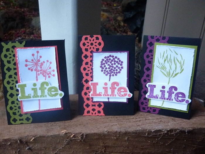

Three cards inside a belly band - the band is made from the background paper I was trying to create but which was too loud for the card.


The three cards - I know that the coral looks more pink than orange but it really is more orange than pink! The base cards are black.  The paper lace is from my newest SU punch.


I'm trying to give an idea of the size of the cards - about 3" by 3 and a half" so they are gift cards probably.

I made another card this morning - CASED it from a magazine - and it had to first stamp backgrounds of music/word/writing/numbers or whatever was suitable and then tear these into strips, glue to another base sheet and cover with a thin layer of white gesso paint.  I think my layer is a bit too think or less opaque that it should have been.  Once this is done I stamped it with a circle stamp and Momento London Fog ink.  I cut it to size and layered it onto black and then gold card.  My base card is black.  I then used StaysOn black ink and stamped my image, cut it out and laid it on the base and traced around it lightly with a pencil. I removed it and using a paper stump I smudged the London Fog around the area to create an impression of a shadow for my image before I stuck it down. I added the little metal tag (coloured with sprayed Copic) and decorated this with a black bling and bling corners as shown. It's a very masculine card.  I have some background paper left over so will try vintage again tomorrow!