Monday 22 April 2019

Last week for the Challenge at Unstampabelles for April

Firstly, Happy Easter!

Image result for easter

Secondly, the Unstampabelles challenge for April runs until midnight on Friday
....so there is still time to enter!

I decided as Easter is fast fading into a chocolate haze behind us, I would make a 
nothing for no reason card, a have a conversation card, a hi how are you type of card.

Of course if it had to have critters, they may as well be some of the crazy Australian ones we have. 

The fast disappearing koala......


The animal on the national coat of arms that we eat.....


Oh, yes, the laughing kingfisher 
and the spiny ant eater or echidna


You have seen that background paper before - Dylusions paint smeared onto white card with a baby wipe,then bokeh'ed up a a bit with some white ink........


The card opens out to make this


Very Vanilla is the card base


I used lots of scraps from the stash pile.
(She says virtuously) 


Why not enter your critter in the challenge?


Thursday 18 April 2019

Bizzy Bec's and Wild Things!

Hello, today I am on the Bizzy Bec's Store Blog with another card made using the Darkroom Door stamp set Fine Flowers.


This time I simply stamped the images onto watercolour paper

I used Tim Holtz sprays - sprayed onto my glass sheet - and then spritzed with water. I picked up the resultant colour in a fine paintbrush and had fun. 

Once the colouring was done I flicked a loaded brush onto the paper and also spritzed a bit of water around to get a nice smudgy background.


I took the Darkroom Door sentiment stamp Wild Thing and used washi tape to mask off the line above and below the words 'wild things' before inking. After peeling this off, I carefully laid a piece of the card onto the inked words and pressed gently with my fingers until I was sure I had transferred the ink. I layered up slightly off and tied it with twine. My doodle around the piece of old DP was with a fine black pen. I added some sequins for sparkle. 


Tim Holtz Sprays Crushed Olive, Fired Brick, Wild Honey
(or use the inks by pressing pad onto glass or similar and then spritizing with water) 
String
Card and paper from my stash
Sequins
Watercolour Paper
Fine Paintbrush

White square card blank from Regal Press

Monday 15 April 2019

Krazy Kritters are midway through the month at Unstampabelles

Well, Hello Peoples

Getting close to Easter isn't it!
Hope you have a great break over this festive season and don't eat too many things that are bad for us - not chocolate of course, that is not bad for us - you can eat as much of that as you like......!


Can you hear the Kookaburra laughing from here?


Today's 'Through the Lens' feature showcases 17yo Tasmanian photographer Lily Pursell from Lily Pursell Photography.


Over at Unstampbelles, we are asking that you bust out some crazy creatures and put them on a bokeh background. There is an explanation of the word bokeh here. 

As it is so close to Easter, I thought I would use that theme for my midway creation
A tag for Easter


What is more Easter than a chicken!

I started with my SU ink pads and sponges and a variety of circle stencils
I used as my background a piece of paper from a 2016 booklet that came with a craft magazine
It had the animals as well in the same pack - I did the fussy cutting.


Not all bokeh has to be white so I started playing with colours similar to the ones on the background
I did end up going white thought - mainly because my sponge was still full of the pan pastel white I used last time.


My last stencil was home made - punches and card stock......

Then I made a grave error - I cut the sheet up, thinking it would fit on a card
I then decided to make a tag using a recycled tag that had a cat collar on it once.

I had to reattatch the pieces and there is a line as a consequence!


The tag is covered in card SU Soft Sky
then in the treated paper

The sentiment is stencilled on also using black ink


Different angles give different colours.
There is a bit of ink sponged on edges too for a grungy look. 


Tied to the cat cage out in the sun - it is a big tag
but you can see the kritters are raised up
I added some crystal dimension to the balloons but you cannot see that clearly here


It also has a shimmer from the pan pastel and is quite cute. 

What have you created?
You can enter it 


Monday 8 April 2019

Who say's Dinosaurs are only for boys....


How stunning is this early morning autumnal sky. 
I spent a lot of my childhood looking at the southern end of this island off the Tasmanian coast. 
Love this state.

Mmmmm....wonder if there were dinosaurs on Tasmania?
(Google search follows....)


Apparently our rocks are too old????


A magical view of Maria Island from Spring Beach at Orford thanks to 
Maree Woolley


 Well, I made a dinosaur card for a girl (but it could also go to a boy)

I purchased a magazine in 2017 and it had a booklet of images and background papers which I carefully placed in my stash! Yes, you never know when this stuff could be useful. 


I tore out a page and glued it to a sheet of white card and let that dry before fussy cutting out the dinosaurs.

To create the background, I used a sheet of the paper from the booklet.
It was already a bit bokeh but I played around with creating a sort to jungle effect to blur the background further.

I used a variety of stencils and Tim Holtz inks.
I finished it off with a bit of glamour with the Pastel Pan Pearl Medium - yummmm


I also added some of the pearl medium to the cut-out dinosaur, as well as some glitter glue and some pearl drops - she is very smart!

I think I should have outlined (s)he in some black ink perhaps or pink ink - purple ink?
What do you think? 
Let me know.


Some fancy cutting of the jungle paper from the booklet and a sticker for the sentiment, outlined with a black pen completed the card.


(S)He is eating some of the leaves.....

I had another dinosaur so cut that out too and created this one.


White stickers, another smaller dinosaur cut out and stuck onto that background paper I had already mentioned is a bit bokeh, some dimensionals - those jungle leaves, which have a patch in the middle removed,   have a sort-of bokeh feel to them too, don't you think?


Dino has a mouthful of leaf.....
The little one behind (Mite) is saying "Do you think he-saur-us?"

Why not go over to Unstampabelles, where the challenge is

Krazy for Kritters 

TWIST Bokeh Backgrounds

See what the DT have made and have a go yourself!


Friday 5 April 2019

Bizzy, Bizzy Me at Bizzy Bec's!

I have just become a team member of the Bizzy Bec's Store and Challenge Blog. The April theme is 'Anything Goes", which is always very popular.

I am waiting for a parcel to arrive from WA (apparently Tasmania, according to Australia Post, is soooo very far away, postage takes forever) so I delved into my stash and lo and behold, I have some Darkroom Door stamps (Bec has these at her store!) and an itch to use my Dylusions Paints to create a background.

Firstly, I smooched some paint onto white card, using baby wipes as they make cleaning up a cinch.
I covered a whole 12 x 12 sheet so I have some other pieces to use later. 
Once I finished, I misted some water on it as well. 

I then grabbed my Darkroom Door Frame Stamp and black ink and selected a piece of the treated paper to stamp this onto - almost like looking through a window. 

I then used Versamark to stamp two daisies from the Darkroom Door Fine Flowers's set and 
embossed it with white embossing powder


I tried a variety of ways to colour the flower petals but ended up doing them with Copic pens
I then cut up/out the small rectangles
I took a piece of black card from my scrap pile and stamped the frame stamp again, this time using Versamark. The I carefully layered the rectangles over the corresponding ones on the black card and stuck them down. 

This got layered onto orange and thn green card and a black card blank. Some yellow twine was wrapped around and then I realised I didn't have a sentiment. 
I found one I liked in an old stamp set that I think was from Annabel Stamps (remember them?)
I thought I had it lined up perfectly - ooops!

Hope you like it! It sorta glows. 


Dylusions Paints -blue, orange and light green: ask Bec to order them for you
Baby Wipes - the cheaper the better
White Embossing Powder
Versamark Ink
Yellow Twine
Copic pens for colouring flowers
White, Black, Green and Orange card - I used Stampin' Up card


Sentiment Stamp - (old) clear Annabel Stamps

Wednesday 3 April 2019

Some Stampin' Up Playing

Some Stampin' Up playing with the Beauty Abounds Bundle, including the big butterfly die!

Beauty Abounds Cling Bundle

As always, I went to Pinterest and got lost for several hours but did make three cards, two of them were almost direct copies.

For the first one, I just went with it from the die cuts
I cut the bottom layer in blue card Pacific Point


It required a shim but came out OK
I then cut the top from Glimmer Paper - Pink


Layering one on top of the other gives wonderful depth and then
I laid them on top of a piece of card that had been used to mop up 
Brusho's leftovers and which was in the stash.


Mmmm, that looked OK too.
Once I decided which part of the background, I cut it to mount on a square card blank
 and added a ruler border and some sequins.


Looks quite specky and does not need a sentiment on the outside

The I made two more for a party I hosted here
In fact my guest and I made them together!

The first one used a part of the big die and stamps from the set


The second one is just stamps and an accompanying punch

Butterfly Gala Photopolymer Bundle

The rectangle is from the latest Rectangle die's and the background paper is from a freebie from Sale-a-bration Botanical Butterfly. Too late now to get that one.


I coloured the butterflies with the watercolour pencils. 

The colour combo in this one is Flirty Flamingo and Soft Sea Foam
and I used a Close to Cocoa ink for the flourish.
The flowers and greenery were coloured with the pencils again.


If you are interested in making any of these, let me know
I can come to you or you can come here. 

Cheers, Susan!


Monday 1 April 2019

How Krazy can those Kritters Be?

Hello Peeps and welcome to anyone who has survived Google Plus and come back to us!


“Keeper of the Night”

Cape Bruny lighthouse under our Milky Way on Bruny Island.
A truly spectacular photo by 
Chasing Light - Photography by James Stone
. James won an award in the prestigious David Malin Awards for Australian Astrophotography for his time lapse nightscapes at Cape Bruny Lighthouse, and this image was shortlisted for the Insight Astronomy Photographer of the Year by the Royal Observatory in Greenwich.


This is one of mine of the same lighthouse during the day
Taken in 2017
Yeah - chalk and cheese, I know......


Over at Unstampabelles, it is time to swing into 

Challenge#88: Krazy for Kritters 
TWIST Bokeh Backgrounds

What is a bokeh background, you ask?
It is a technique. 


Bokeh BOH-kay — also sometimes pronounced as BOH-kÉ™,

The term comes from the Japanese word boke, which means "blur" or "haze", or boke-aji, the "blur quality". The Japanese term boke is also used in the sense of a mental haze or senility. That's often me - very BOKE today! 


The term bokashi is related, meaning intentional blurring or gradation.

So we want you to Bokashi your background so you get a Bokeh look to it. 

Most people do it with light colours or white but that is not necessary as long
as the background is obscured or blurred.

If you Google Bokeh Background images you get some amazing ideas!


I love this one - raindrops on a window with lights behind it.....
If you look again to James Stone's photo of the lighthouse (above), the sky is almost bokeh too there.

Having said that I did use white for my piece today

I decorated a small pizza box (made by Stampin' Up and in the current catty)

I used my Dylusions paints as I had them out for another project and I might as well used them before I put them back, right?


So careless smooching with a smudger to add some blue and green for ground and sky.
I wasn't quite sure until I started which side to use - there is a matte and a shiney side.
I ended up colouring the matte side
By then I wasn't sure either which way would be the top of the box, so I did both top and bottom!
Then I folded it up and checked.....


....before I added my sun with rays


When I came to use the white for the bokeh effect, I watered it down a bit and so I looks less blurred and more snowflakes!!!!!
I would have been better to have added some bigger circles and blurred it all a bit more.
When it was all dry I decorated it.


The 'Happy' was an old rub on that refused to rub on without great difficulty. I ended up having to lift it off the plastic and carefully place each letter.....
'Easter' was cut out of a decorative egg design die


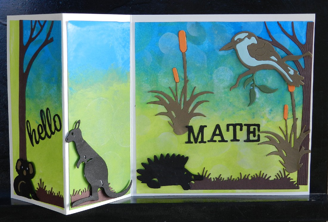
My bunny is a little Krazy Kritter - a die I have had for ages and haven't used before I think.
He is sparkly like one of the eggs!


The pizza box open - it would take some folded notes, a gift card or 
some small sweets or a small gift of some kind


Hope you like my Kritter
You have a few weeks to create one yourself
It does not have to be for Easter

See you at Unstampabelles where there are some more pieces from the DT to inspire you!