(Don't think I haven't noticed that my follower's on Blogger are up to 99 - might just have to give away something to Ms/Mr 100!)
I was
This is the card I saw:
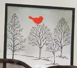
This is mine:
Here I used Momento ink for the trees - From SU's eternal Lovely as a Tree - but I stamped off the ink first so it was not as bright! I also used post-it notes to screen off my background and I kept them in place when I stamped so the trees disappear on the edge rather than flowing over. I used Tim Holtz Distress inks to make my background, with a touch of blue. My bird is actually a die cut (Memory Box) and the ribbon is SU ribbon. The card is SU card - Whisper White and Black - and the card blank is a commercial one from Regal Craft.
I will now confess that this is the second attempt!
Here is the image from the first, cut and replaced onto other card - it hit the bin at first but I rescued it!
Sharper and darker image - I smudged the first background, even though I had masked it and then made it worse trying to fix it - so the scissors and cutter came into being......
Similar idea but a layered card rather than CAS. My background 'paper' is a Kaiser packing sheet - too pretty to throw away!
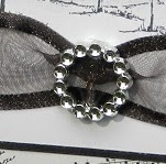
el cheapo plastic 'bling' buckle purchased in a chuck out bin somewhere and laying in the stash! Ribbon also from stash.
Detail on the Kaiser packing sheet (sideways)
Same card used as before
So, there are the two
Which one do you like best?
I will enter these in the following challenges:
Crafting When we Can: Use leftovers - yep, my second card does that! Nothing new used here!
Opus Gleui: Black and White plus a pop of colour - the CAS card
abc Challenge: M is for monochromatic......both cards or either


6 comments:
They are both great cards.
I do prefer the cleaner re-do card. How very resourceful to re use the packaging - wouldn't know if you didn't say!
What a beautiful card! The ribbon, the "buckle", the details such as the music in the corner, oh my! It's wonderful! Thank you for joining us at Opus Gluei for our challenge, we hope to see you often!
Ah I just love these cards....and wish I'd thought of this when making my own. The bird is the perfect accent. Lovely work - wish it was mine....and as Electra has already said, thanks for joining our challenge at Opus Gluei this week.
Waw such a gorgeous project! thank you for joining us at ABC Challenge. Hugs! Mojca
Oh wow....love the cards you came up with.
You are good, this is a beautiful card, both of them are. I love spending time getting inspired on Pinterest, but mine never turn out this pretty! Love that you even were thrifty and saved the one that was less than perfect and did so beautifully. The red bird really pops on the stamped background, I like that a lot. Thank you for taking time and inspiring US over at Opus Gluei! Now send me some of that crafting mojo you seem to have extra of, pretty please??? ;-D
Post a Comment